


Special Reports
Going Mobile: The Options
 As of this writing, Google’s latest “cross device” research reports that 80 percent of all consumers who browse the web spend some of their time daily on a smartphone, compared to 67 percent on a computer and 16 percent on a tablet. And while most people move among devices throughout the day, 32 percent do all their searching on a PC while 39 percent do it all on a smartphone. And consider the time spent on each—170 minutes on phones, 120 minutes on computers and 75 minutes on tablets. Time to go mobile; here are your options.
THE APP
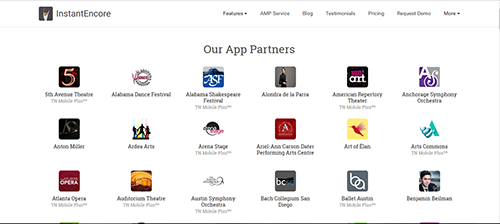
A piece of code that gets downloaded onto a phone or tablet, an app can perform a specific task, such as providing an easy way to check movie showtimes at your favorite cinema, warning you about traffic jams, or enabling you to engage in creative play. Many apps are free or almost free. (PHOTO: A few of InstantEncore's app partners.)
Pluses
- You can’t break your web site building an app—users interact with it on their phone or tablet.
- Apps are great for spot uses like festival maps, last-minute ticket purchases, intermission drink orders, and guaranteeing a cab.
- Some apps are widely used by arts organizations and therefore easy to employ, like the InstantEncore app, which is set up for pushing important messages and special offers, providing information at the venue, storing calendar info, and soliciting feedback.
Minuses
- It’s up to the customer whether to download the app.
- A quarter of all apps that consumers download to their phones are one and done— they are used and then almost immediately deleted. Apps have to be considered essential, useful, or cool, like an app for doctoring photos or new movie previews, to be long-lived.
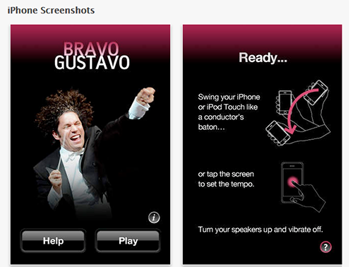
- Some apps are device-specific, e.g. for iPhone only, or Android only, requiring that you maintain several of them. ß Really outstanding apps, such as the LA Philharmonic’s “Bravo Gustavo” conducting app, which allows you to speed up or slow down the music just like a conductor, can be expensive to create.
- An app that’s not seamlessly integrated into your main site will cost your staff time. (PHOTO: “Bravo Gustavo” conducting app: cool, but expensive to create.)
MOBILE WEB SITE
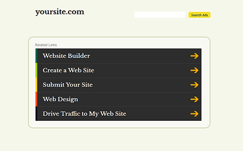
This is generally a subset of a web site, made up of fewer pages, or pages slightly redesigned to fit on a smaller phone and tablet screens, but driven by the same back-end structure and utilities. A mobile web site’s home page may have a slightly different address, such as https://www.carnegiehall.org/m/home.aspx, versus http://www.carnegiehall.org/. Some mobile-site templates are free (such as m.YourSite.com) or nearly free. Others can be custom-designed. (PHOTO: Yoursite.com offers free mobile-site templates.)
Pluses
- Any phone or tablet that can get onto the web can see your mobile site. No installation is required.
- Some app creators already offer three-way solutions for iPhone, Android, and small-screen web browsing.
- If your main web site doesn’t look very good on a mobile device, or if a redesign is months or years away, then a mobile site can plug the gap. (
Minuses
- You now have two sites to update. Keeping them in sync requires diligence over the long run.
- Designing a mobile site almost always leads to some retrofitting on your main site, to keep key branding consistent.
- Checkout options may not integrate with your in-house ticketing. For instance, you may be able to sell single tickets but not subscriptions, general admission but not reserved seats.
MOBILE-FRIENDLY SITE
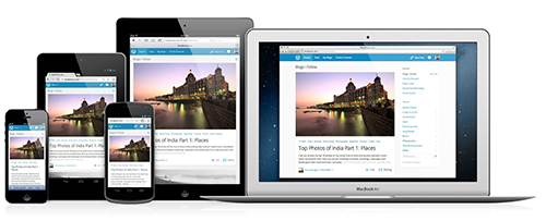
If a web site does not look good on current mobile devices, but a major redesign is not in the immediate offing, a site can be made more mobile friendly by centering the content on the page so that it looks the same across all platforms, by streamlining the navigation, and by simplifying the pages so they load faster. (PHOTO: Mobile friendly content stays the same on all platforms.)
Pluses:
- De-cluttering the site for mobile users will improve the performance for desktop users, too.
- Adding click-to-call buttons and thumb-friendly action buttons will help mobile users without compromising desktop performance.
Minuses
- As you remodel, you may break something you’re trying to fix.
- If your site is more than five years old, it may easier to undertake a comprehensive redesign.
- Your thinking will be web-down. Designers today are recommending the opposite. Start with mobile requirements, then design up.
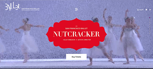
RESPONSIVE WEB DESIGN
This is the current web site ideal. The responsive site detects the device that is accessing it and delivers the page accordingly. Content components are centered on the screen or they are optimized as
modules that can stack vertically or horizontally. To get the idea, go to the San Francisco Ballet web site and widen or shrink the screen. You’ll see the content move around. (PHOTO: San Francisco Ballet’s web design is responsive.)
Pluses
- You manage the content once. As a concept, it’s ideal.
- Fluid layouts are fun.
- You can test the concept with a special-event or mini-festival site, such as the Brooklyn Academy of Music’s Next Wave Festival.
Minuses
- It is impossible to convert a large existing web site quickly. The project has to be planned carefully.
- Testing must be periodic and habitual, to make sure the templates continue to perform with reliable flexibility.
MOBILE STRATEGY AS MISSION CRITICAL
The optimum approach is for an organization to tie together all aspects of its technology infrastructure, brand management, business needs, analytical tools, and donor/customer relations into a smoothly functioning system built to last. The mobile solution should be central to high-level thinking, since it is the fastest-growing segment of the market. It cannot be an afterthought. It requires the involvement of the entire organization and almost every internal computer system, as well as a high position in the design and communication strategy. Using a consultant is typical.
Plus
- The increasing sophistication of mobile users will be key to improving an arts organization’s reach, brand, and performance.
Minuses
- Massive restructuring is likely to involve many months of initial planning and investment.
- The mobile field is changing so quickly that continuing annual upgrades will also be required.
 Nancy Malitz is the publisher of ChicagoOntheAisle.com. She has been writing about the intersection of the arts and technology most of her career. She developed some of Gannett Media’s first newspaper web sites and worked on strategic projects for media change.
 FEATURED JOBS
 RENT A PHOTO