


Special Reports
3 Mobile Solutions, 3 Years Later
 In our 2013 Special Report Mobile Marketing: The Arts in Motion, we checked in with a number of organizations to find out how they were using mobile technology. Three years and a steep learning curve later, here’s an update on their progress.
Eighth Blackbird
 Sweat equity, WordPress, and a musician-friendly design
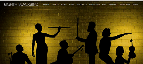
Issue: In 2013, clarinetist Michael J. Maccaferri, a member of the contemporary group Eighth Blackbird, searched through a vast array of WordPress templates (themes) and add-on tools (plugins) to create a web site that would look as good on cellphones as it did on laptops while reflecting the group’s sense of style. Wordpress today powers about 75 million web sites worldwide and has legions of do-it-yourselfers in an open-source environment that encourages sharing. For small budget organizations with patience and a knack for experimentation, Wordpress was—and still is—a good way to go. (PHOTO: Eighth Blackbird’s home screen on desktop.)
Mobile Factor: All members of the group are heavy mobile users and believe their fans are also. Their original thought was to design a one-size-fits-all responsive web site that would work fluidly across all mobile devices by detecting the screen size and lining up the elements accordingly. But the idea was fairly new in 2013, and the experiment didn’t scroll correctly or look right on all platforms. So Maccaferri chose similar themes, one for phones and one for the main site, and made them resemble each other as much as he could, living with the extra work of keeping them both up to date.
 Challenge: The original name eighth blackbird became Eighth Blackbird as part of an extensive rebranding process as the ensemble entered its 20th-anniversary year. “We had been using the same logo and typeface since the beginning and we thought we should reestablish our look,” Maccaferri said. “So that gave us an opportunity for a web site makeover, too.” At the end of August 2016, mobile users accounted for 27 percent of the visitors and the percentage was continuing to trend upward
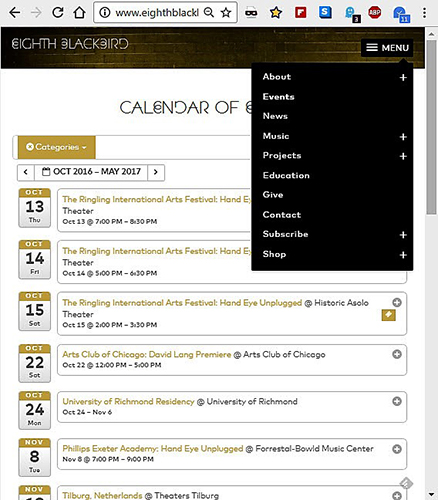
Solution: With help from a communication design company called Thirst, the ensemble was able to identify a new generation of beautifully streamlined themes that are responsive to all screen sizes, ultimately choosing “Two-Tone” from a company called AudioTheme, designed specifically with musicians in mind. “The back end has really great built-ins for streaming audio and displaying a tour calendar,” Maccaferri said. “We had to make some tweaks but it’s much more flexible than what we had, it looks great on all screens, and it saves me time because I don’t have to set device sizes and re-do the layout. I was shocked to see how far the CSS has come,” he said, in reference to the built-in “cascading style sheets” of code that dictate how the content will look on a dizzying array of screens. “It makes the functionality really fluid so spacing works cleanly on even the smallest devices.” (PHOTO: Eighth Blackbird calendar on a tablet, with pop-out menu.)
Upgrades: Until recently Eighth Blackbird handled its sales offsite through Amazon and iTunes, but now the group sells its own recordings and other merchandise using WooCommerce, a free WordPress shopping-cart plugin, and PayPal. Both are mobile compatible. The group works with a Chicago company called Creative Partners, which handles customer relations and fund-raising on behalf of three Chicago non-profits, sharing the overhead among them. Instead of Tessitura, which is used as the customer relations database by organizations with bigger budgets, Creative Partners uses MailChimp to capture subscriber information and Patron Manager to store customer information for future development. “We’re still learning to do things more efficiently,” Maccaferri said.
Steppenwolf Theater Company
 Streamlining to stay ahead of the curve
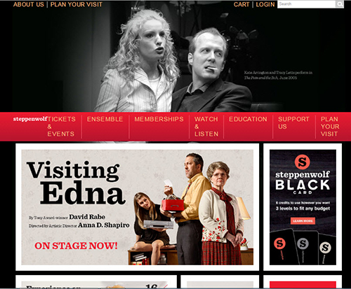
Issue: Steppenwolf was on the cutting edge of expressive web design back in 2013, when it underwent an elegant and extensive web makeover. At that time a mobile solution for buying tickets was not something that Steppenwolf’s back-end Tessitura system could handle, so the company cobbled together a solution using CloudTix for mobile phone users who wanted to buy a ticket. Within a year, mobile traffic had increased from 10 percent to 15 percent. Today, Steppenwolf’s mobile traffic is at 34.73 percent, and 58 percent of Steppenwolf’s email communiqués are accessed on mobile devices. (PHOTO: Steppenwolf home screen on a desktop.)
 Mobile Factor: The CloudTix platform was basically a onesize-fits-all solution, and pretty basic, according to Steppenwolf’s Digital Marketing Manager Kevin Castillo. “It was great for its day, but there was just a simple template calendar and layout, with room for a blurb about the show, and the opportunity to purchase a ticket, but that was about it.” (PHOTO: Steppenwolf Digital Marketing Manager Kevin Castillo.)
 Challenge: Steppenwolf was running three separate content management systems back then. There was the Tessitura database for all the donor and subscription business operations, which was separate from the features and informational content on the we bsite, and then there was the CloudTix platform for mobile ticket purchases. Interaction was very limited. But mobile use was exploding: “It was our fastest growing segment, and we ran up against the limitations of having that separate mobile site. Our mobile users expected the full experience, with videos and photos. They didn’t want to be told they had to visit the desktop site to see all that.”
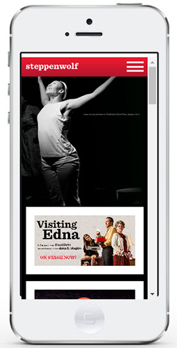
Solution: Steppenwolf pulled the strands together with a cloud-based product called EpiServer that combines content and transactions, linking these to Tessitura via an interface made by Adage Technologies. Now subscribers and donors can check in via mobile and be recognized, and the Steppenwolf web site is fully responsive to all screens. “It was very tricky to implement,” Castillo said. “We had to develop a new structure while the old one was in place. First we made the transactional path responsive while we continued to work on the rest of it. We finally flipped the whole thing over in mid-July.” (PHOTO: Steppenwolf home screen on a smart phone.)
Ahead: Steppenwolf is one of the first sizable arts organizations with a webs ite that is fully responsive to all screen sizes. “The biggest challenge is that digital change is coming so quickly,” Castillo said. “We try to be as proactive as possible, identifying trends early, reading articles every day, sifting through the changes. But it’s not easy. We’re now at the point where 65 percent of people’s online time is spent on mobile devices with desktop as the secondary touchpoint. It’s like that hockey analogy—what makes a player great is that he doesn’t skate to where the puck is. He skates to where it’s going to be.”
Brooklyn Academy of Music
 A work-in-progress with New Wave paving the way
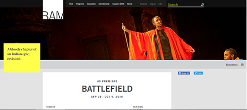
Issue: BAM is a multi-arts center with a reputation for adventure across all its events including theater, music, dance, cinema, club acts, and individual artists. Although the company has been through multiple technology upgrades in the last three years, its sprawling web site is not yet fully responsive for mobile devices. (PHOTO: BAM Next Wave Festival home screen on desktop.)
 Mobile factor: In March 2013 BAM expanded its Tessitura ticketing services into mobile phones, optimized for thumbs but offering the same look and feel that customers had on the web. People didn’t have to fill out any forms to buy a ticket if they had done it before. Within a week of the launch, BAM was doing nine percent of its ticketing services on mobile platforms. But in today’s world, its mobile screens are due for an upgrade, said John Lanasa, BAM’s VP of marketing and communications, who previously served as marketing director at the Metropolitan Opera. (PHOTO: Brooklyn Academy of Music VP of Marketing and Communications John Lanasa.)
 Challenge: “Ticketing is really the only thing the BAM mobile design does well,” Lanasa said. “Five years ago, people were using phones for what they needed this minute, but today they are using phones most of the time, for everything. So we are ready for an upgrade. We’re in the process of figuring out what mobile needs to be.”
Solution: BAM wants to move to a responsive web site, one solution for all screens, Lanasa said: “But the new thinking is to design for the phone first, and then iterate to the browser, rather than to think about the web site first and then scale it down.” BAM web site traffic is split at about 60-40 between desktop and mobile, and phone use is continuing to grow. “We don’t need to push everybody to the phone, but we do want to make sure it is as positive an experience as possible,” Lanasa said. “For a large performing arts organization like ours, a cultural purchase is a complicated one that often takes many visits, so people might be doing research on the phone and going to the desktop later, or vice versa.” (PHOTO: BAM Next Wave Festival screen as it would look on a smart phone, via Screenfly.)
A trial: Nine BAM employees from various departments worked to create new responsive pages for the 2016 Next Wave Festival, using Screenfly to get a sense of how it looks on various screens. “You can spot the difference right away,” said Lanasa. "There is lots of yellow, more fluidity and flexibility. On the older pages, we’re using templates that are rather fixed and rigid, with one ‘big moment’ for information and everything else stuck at the bottom of the page. The new design is more modular, and it takes advantage of the fact that people are accustomed to scrolling now, so we have about six different kinds of toys that we can stack on the page, whether it’s a video or some photos or a quote, whatever makes sense to show that event to best advantage.”
Ahead: With further incremental steps along the way, Lanasa’s goal is that BAM’s web site operation be completely responsive by June 2018.
 Nancy Malitz is the publisher of ChicagoOntheAisle.com. She has been writing about the intersection of the arts and technology most of her career. She developed some of Gannett Media’s first newspaper web sites and worked on strategic projects for media change.
 FEATURED JOBS
 RENT A PHOTO