Special Reports
Going Mobile: The Options
 A look at the choices, and each of their pluses and minuses
As consumers peruse entertainment choices and buy tickets on mobile platforms, adapting web content to devices with slower speeds and smaller screens is the name of the game. Here are the options.
 THE APP: A piece of code that gets downloaded on a phone or tablet to perform a specific task, often linked to a web site. Some basic apps are free to presenters (and consumers), or free for basic features and leased with deluxe features—the so-called “freemium” model. Some are custom built.
Pluses
- You can’t break your web site building an app—the two are separate.
- Apps are great for spot use like festivals with people on the go—check out National Cherry Blossom Festival app.
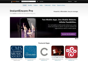
- Some apps are already widely used and easy to employ, e.g. Instant Encore app.
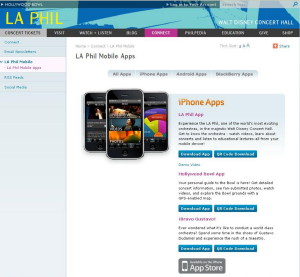
- Really novel apps create buzz , e.g. LA Philharmonic’s Bravo Gustavo app, which turns your phone into a conductor’s baton.
 Minuses
- You can’t force a customer to install an app.
- Customers prune apps over time to essentials such as commuter train info and movie showtimes.
- Apps are device-specific. You will need separate apps for iPhone and Android at least, up to 11 if you want to be like CNN.
- Since apps are separate, selling tickets typically means workarounds for your box office, such as app “reservations” later converted to specific seats.
MOBILE SITE: A subset of a web site, made up of fewer pages, or pages slightly redesigned to fit on a small screen, but driven by the same back-end structure and utilities. Mobile web site’s home page may have a slightly different address—YourSite.com/mobile/index.htm or m.YourSite.com. Some mobile-site templates are offered free or “freemium” leased. Others can be purchased outright or custom-designed.
Pluses
- Any phone or tablet that can get onto the web can see your mobile site. No installation required.
- Some app creators already offer three-way solutions—iPhone and Android apps, plus a similar-looking mobile web site for all other mobile users.
- Since mobile sites are web sites, streamlined sales tied to your in-house ticketing system are possible.
Minuses
- You now have two sites to update. Keeping them in sync requires diligence over the long run.
- Designing a mobile site almost always leads to some retrofitting and re-thinking of the web site to keep the brand consistent—streamlined logo, etc.
- Web site ticket-sales features, especially select-a-seat functions, may need re-designing to work with thumbs and small screens.
MOBILE-FRIENDLY SITE: Most new cell phones and tablets can go directly to the web, but most web sites do not load quickly or fit properly on small screens. Typically, sites can be made more mobile friendly by centering the content on the page, streamlining the navigation, and simplifying the code that operates it. It’s a step well short of a new web site. But the effort may make the desktop version look better, too.
Pluses
- De-cluttering your site for mobile users will improve the look of your regular web site also.
- Reducing the number of components on a web page and downsizing your images will make pages load faster on all platforms.
- Adding click-to-call buttons and thumb-friendly action buttons will help without compromising the look on the desktop.
- If you’re planning a one-web site-serves-all upgrade in a year or two, then mobile-friendly improvements now are a stopgap.
Minuses
- As you remodel, you may break something you’re trying to fix.
- If your site is more than five years old, it may have code too bulky to be significantly improved for mobile. Better to clean up your home page and sprint toward a full web site 2.0.
RESPONSIVE WEB DESIGN: The framework of a responsive web site will shrink and expand, and even rearrange itself, depending on the size of the screen that’s displaying it—from iPhones up to and including big screen HD TVs. Device detection is built into the code. To get the idea, go to Starbucks.com, click on the double box icon (minimize button) in the upper right corner of your screen to shrink the window, then put the cursor in a corner of the smaller screen and drag it in diagonally holding the left button down.
Pluses
- You manage your content once—no work duplication. As a concept, it’s ideal. The design adjusts by itself to all screen sizes.
- Fluid layouts are fun. Go to CrossingBrooklynFerry.com, holddown the cursor and drag the display area in diagonally to see the page flop around and re-arrange.
- Free templates are available. You can test the concept with a special event or mini-festival.
- A design that works for all is optimized for none by definition.
- Check out the Philharmonia Orchestra app; it fits the iPhone like a glove.
Minuses
- It is impossible to convert a large, existing web site to a responsive design quickly. It requires re-thinking the structural grid for every page type.
- Responsive design is so cutting edge that you may find yourself on the bleeding edge and need a consultant.
- Mobile web use is increasing so sharply that we’re in a disruptive phase technologically. If you don’t upgrade your site often, you may want to wait for best practices to develop.
MOBILE INTEGRATED BUSINESS MODEL: This is the optimum approach for an organization wanting to tie together all aspects of its technology infrastructure, brand management, business needs, analytical tools, and donor/customer relations into a smoothly functioning system built to last. It requires the involvement of the entire organization and almost every internal computer system. Using a consultant is typical. The mobile solution comes out of high-level thinking about the likely impact of major technological change.
Plus
- Mobile belongs in any company-wide initiative to improve an arts organization’s brand, communication, software and infrastructure, ticket sales, and donor/customer relationships and behavior analysis.
Minus
- Massive restructuring involves years of planning, major grants, and professional consultancy. Unless you’re involved in that right now, some interim accommodation for mobile will be required.

Nancy Malitz is the publisher of ChicagoOntheAisle.com. She has been writing about the intersection of the arts and technology most of her career. She developed some of Gannett Media’s first newspaper web sites and worked on strategic projects for media change.


 FEATURED JOBS

 RENT A PHOTO


