By James Jorden
The Metropolitan Opera debut of Donizetti’s Anna Bolena, an amazing 180 years into the work’s history, won mostly respectful reviews last week—in between snipes at Anna Netrebko’s momentary breaking of character during the “Tower Scene.” A common thread in both published and popular opinion, though, was that the piece itself was not very interesting, at least absent a Maria Callas or Edita Gruberova to kick a little life into it. It’s hard to argue with taste, but possible, I think, to propose that the perceived longueurs of the opera are not integral to the work but rather a function of the way it was presented.
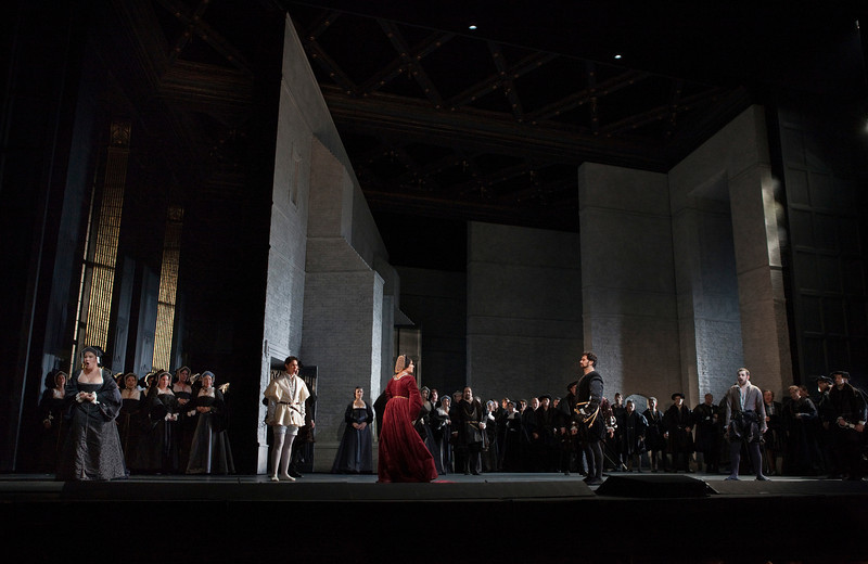
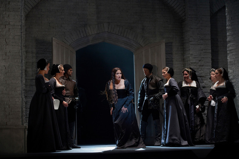
It’s become a cliché of faint praise to say that a director “took the show seriously,” as if everyone’s first reaction to an opera would naturally be to send it up. And the lazy critic’s favorite adjective is “handsome,” descriptive of any production that doesn’t feature actual vomit as a design element. Yet “serious” and “handsome” are about the most complimentary things you can say about the Met’s production by David McVicar. The sets (Robert Jones) revolve around two sorts of three-dimensional walls: weathered gray brick and weathered gray wood paneling; costumes by Jenny Tiramani are archeologically correct 1530s silhouettes interpreted in stiff black and gray silks. The monochrome is interrupted by the odd soloist’s costume: a claret velvet riding habit for Anna, for example, or a canary-gold brocade doublet for the king. The lighting (or as the old joke goes, “the obscurity”) by Paule Constable remains flat and bone-colored even in the drama’s one exterior scene: it’s overcast outdoors and in.
Now, production design based on monochrome need not be dull: think, for example, of the recent Atys at BAM, or, farther in the past, the John Dexter/Josef Svoboda staging of Les Vêpres siciliennes that premiered at the Met in 1974 and was revived as recently as 2004.
But there are two important differences between these productions and McVicar’s Bolena. The first is that in both Atys and Vêpres, “black and white” was a metaphor for the dramatic theme of the work. In Lully, monochrome symbolizes a conscious limiting of emotional choices: restraint. In the Verdi, “black and white” signifies the polarized nature of revolutionary politics. With no middle ground between the French oppressors and the Sicilian freedom fighters, there are no “shades of gray.”
Another reason that so restricted a design choice is workable is that the operas themselves offer a good deal of variety and contrast in their musical forms. The Lully includes, for example, a number of brief dance interludes breaking up the long segments of accompanied recitative; the Verdi, written for Paris, offers a grab-bag of episodic genre pieces: Hélène’s narrative song in the first act and her brilliant Bolero in the last, the tarantella in the second act, and of course the flashily superfluous “Four Seasons” ballet. (Even though this last piece was cut at the Met, the remainder of the score retained a strong sense of variety.)
In contrast, Anna Bolena is a very unified score with little in the way of light relief: even Smeton’s ditty in the first scene has a dramatic purpose. The tone is further darkened by keeping the prima donna’s vocal line fairly low, in her veiled middle register.
Though he rightly has little control over an opera’s musical musical tone, McVicar is tasked with creating an interesting and thoughtful visual scheme. However, in this case he offers no apparent thematic reason for so severely restricting the color palette. All that communicates is that Henry VIII presides over a very dreary court indeed, as if Anna were already imprisoned—and her ladies already mourning her execution—before the action of the opera even begins. This Anna Bolena tips past “tragic” to something very close to “dour.”
Now, even a dour Anna Bolena arguably might make sense in the context of a scholarly presentation of the work, in connection with some conference on Donizetti performance, or even in a theater with a history of presenting the opera: having heard the work done many times in various ways, for a change to see the “dark” Bolena. But this was the Met premiere of a nonstandard work, and, what’s more, the occasion was more than just a simple production premiere. It was also the opening night of the opera season, a social and cultural event regardless of the caliber of the onstage performance, and—this doesn’t happen every year, of course—this evening celebrated the ascent of Netrebko to the status of company prima donna, the coronation of a star.
What was lacking on so special an occasion was glamour.
Now “glamour” is a bit of a dirty word in the arts: the very term originally meant a magic spell that distorts the victim’s perception of the real word. Specifically, a “glamour” made something mundane or even ugly seem exotically beautiful. Thus in its very origin glamour is a sort of lie, a trick, and therefore not suitable to art, which is supposed to be dedicated to the revelation of truth.
Glamour should not be confused with elegance, a more trustworthy, even admirable quality of Platonic proportion. An architectural example of elegance might be the Seagram Building, which Herbert Muschamp in the New York Times lauded for “the symmetry of its massing on the raised plaza; the tripartite division of the tower into base, shaft and capital; the rhythmic regularity of its columns and bays; the antique associations borne by bronze.”
In contrast, glamour is illusory, vaguely dangerous, even at times skirting bad taste. Think of the description by Brett Stephens in the Wall Street Journal of the Chrysler Building’s “eagle-headed gargoyles, which seem ready to take wing from their perches on the 61st floor; the huge triangular windows arranged along the curves of seven concentric setbacks pushing centerward and pointing skyward; the ribbed, stainless-steel crown that sparkles by day and is lit from within at night…”
In short, glamour impresses, and is enjoyed, because it not only creates beauty, but constantly reminds the viewer that this beauty is a function of artifice: “never forget how many minute decisions had to be made to create this masterpiece!”
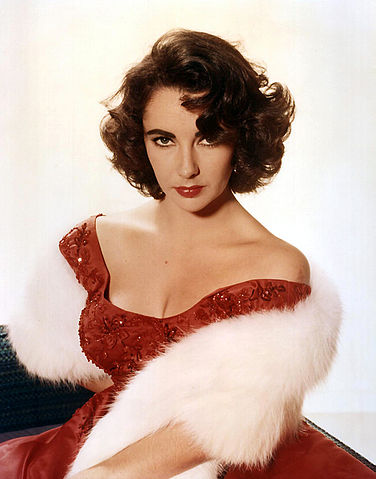
Opera, as a collaborative form that is forever struggling to wed high art to popular appeal, lends itself perhaps all too readily to glamour. The stories are almost invariably set either in a romanticized past or some vaguely-understood exotic land like Persia or China or California, and even the default image of an “opera diva” is very much in mold of that avatar of Hollywood glamour, Elizabeth Taylor: big hair, big bosom, tiny waist, lots of paint on the face, and glitter everywhere.
So it’s easy to see why some opera directors (and, it is becoming increasily apparent, one impresario in particular, Peter Gelb) are less than enthusiastic about glamour. In short, they are afraid that everything will end up looking like this:
For more than 40 years, while Franco Zeffirelli reigned as fairy godfather to the Met, every production with even a pretense to fanciness had to ladle on the spangles and velvet drapes. Even non-Zeffirelli stagings gradually tarted up over the years. When the Marschallin (Leonie Rysanek) climbed out of bed in the 1969 Merrill-O’Hearn Rosenkavalier, she slipped into a simple mauve chiffon peignoir. Forty years later Renée Fleming was upgraded to a peachy-gold lace confection heavily reimbroidered in iridescent beads: a smashing evening look perhaps, but surely overkill for a quiet breakfast à deux.
Since Zeffirelli took his official leave from the Met in 2008, the company has experienced—some would say suffered—a backlash against glamour, or at least against those qualities that, thanks in part to Zeffirelli, are wrongly perceived as the synonyms of glamour: triviality and meretriciousness.
Thus, McVicar’s resolutely post-Zeffirelli Anna Bolena: accurate in period detail, certainly not cheap, but scant on glamour. The court of Henry VIII appears positively Puritan, and, what’s worse, leading lady (and presumpitive Queen of the Met) Anna Netrebko is made to look matronly. “Handsome,” that awful word, comes to mind again. Who wants a handsome diva?
On a less frivolous note, the story of Anna Bolena is bent a bit out of whack by the relentless severity of this production. In very first scene, the queen enters, expressing a vague sense of unease: “Afflitta, è ver son io… / nè so perchè… Smania inquieta, ignota / a me la pace da più giorni invola.” No, there’s no immediate threat, only… something’s not quite right. As the saying goes, a cloud has momentarily passed over the sun. But McVicar keeps his gaze firmly fixed on the cloud with never a glimpse of sunshine, either figuratively or literally.
The opera opens in almost total darkness, with most of the court in funereal black. Anna enters, backlit, and as she becomes more clearly visible, we see her dress is also black, though with lots of bulky white fur and brocade trim. The effect is heavy and unflattering: she looks not so much gowned as upholstered.
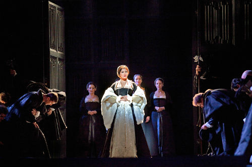
It’s just a terribly sad dress, much sadder, surely, than poor Anna should feel barely five minute into the opera. She looks regal, yes, but not like a romantic young queen; rather, like a resigned queen mother. You want to say to her “maybe if you got out of the mourning, things might not look quite so hopeless.”
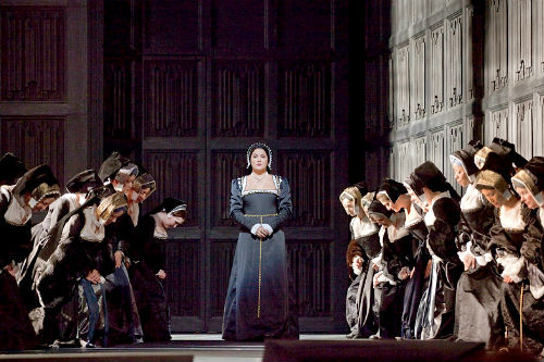
But instead the queen just goes from grim to grimmer. Even a brief flirtation with color later in the act isn’t much of an improvement.
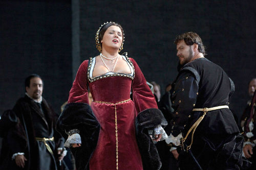
True, this dress is red, but such a sober, mature red, and look at the cut and the fit. Oh, I’m sure the pattern is very authentic, but the very deep trapezoidal neckline combined with the slightly raised waistline (emphasized by the tightly-drawn chain belt) makes Netrebko’s torso look short-waisted and shapeless. Heavy sleeves, again with massive fur cuffs, further widen the silhouette at its midpoint. The French hood headdress (which apparently the real Anne Bolyen favored) lies quite close to the head, with the hair parted and dressed flat, the back confined into a snood. The contrast of the tiny head and blocky body is ungainly, certainly unflattering for Netrebko. She doesn’t look pretty or charming, let alone fascinating; in a word, she’s not glamorous.
How much more effective might the opera be if we first saw Anna still in the prime of her beauty, dressed to reflect the witty, vivacious personality contemporary historians noted in Anne Boleyn. It wouldn’t take much, given Netrebko’s beauty and magnetism: slightly softer textiles, a less lugubrious color combination (even pale gray or silver would do) a more conventionally pretty neckline, a waistband dipping to a dainty point in front to elongate and slim the proportions of the upper body. (Admittedly, these tweaks would violate strict period design, but not by much: portraits from the early 1540s show Anne’s successor Catherine Howard in court gowns in this more visually appealing style.)
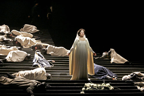
Further, how much more more striking would be Anna’s simple black shift in her prison scene if we had the contrast of “happier” gowns earlier in the evening. Of course, that would require a different sort of sensibility than what McVicar brought to this project: after all, the big elevator “reveal” for the prison scene replaces a gray brick wall with… a slightly different gray brick wall.
It’s as if McVicar is determined not to let the audience have any fun. His drab aesthetic is just the sort of thing one of history’s foremost experts on glamour, Diana Vreeland, rejected: “We all need a splash of bad taste — it’s hearty, it’s healthy, it’s physical. I think we could use more of it. No taste is what I’m against!
The lack of glamour exemplified in this Anna Bolena seems to be the standard at the Met moving forward; Peter Gelb apparently doesn’t trust anything too pretty. The question is: will audiences buy into his “no bad taste” aesthetic, or will they simply be bored? That distinguished music critics and avid fans alike complained that Anna Bolena was overlong or dull is not an encouraging sign.
Photos: Vêpres and Anna Bolena by Ken Howard; Traviata by Marty Sohl.
Tags: anna netrebko, atys, black and white, Black Swan, carnegie hall, david mcvicar, donizetti, franco zeffirelli, glamour, john dexter, josef svoboda, joseph volpe, la traviata, lincoln center, live performance, metropolitan opera, new york observer, period costume, regie, repertoire